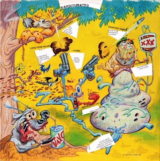
 "Captain Quantum Vs. The Ugly Druggies" is an educational, anti-drug board game by John Kricfalusi from 1990 (before Ren & Stimpy). Aimed at kids.


Vintage art, magazine ads, photographs, record covers and more
 "Captain Quantum Vs. The Ugly Druggies" is an educational, anti-drug board game by John Kricfalusi from 1990 (before Ren & Stimpy). Aimed at kids.


28 comments:
WOW ! I love all these designs. I never heard of this board game.
wow dude, awesome. you know who colored 'em? you think it was lynne. paint jobs are gnarly. thanks so much for sharing!
i wish there some stuff like this today
amazing rare stuff!!
thnx man.
Dude get off John's cock aleady. I like how everytime you post his stuff you have to pretend like he can't draw anymore, while meanwhile on your other blog you miserably copy his style in every post. Sounds like your just obsessed with him. You want his cock so you trash his girlfriend for attention. What a loser you are.
Truly amazing art (and beautiful scans!) But if John K can't draw then I don't know who can
everytime you post his stuff you have to pretend like he can't draw anymore
i'm not pretending
Very cool! The wonderful irony is how drug-inspired a lot of the imagery looks.
Wouldn't say those are nessecarily bad Ryan but compared to this, they do look like shit.
I have this game, too, but some of these illos I've never seen before. I have to go pull it out of storage and double check. My set might be incomplete!!! AAARRGGGHHH!!!
Just because his style has changed doesnt mean he can't draw in previous styles. You always grow as an artist. That's how drawing is. You don't draw anywhere near as the "bad" examples you posted.
This might come as a surprise to you anonymous John K. nutsack chin resters, but I am allowed to have an opinion. And my opinion is that John K's current drawings are wonky, ugly and shitty. Sorry if you do not agree.
Wow! Thanks so much for posting these.
This is gold!!! Thanks a lot for posting them!!! I found a few images of this a while ago but the quality was not so good.
The drawings are really inspiring, like the old R&S episodes and it's probably John's sexiest male character he ever created!:3
The colorings is absolutely beautiful! I wonder that they used cels for the characters, the BG itself shows different types of paint techniques.
The druggies have also a very Basil Wolverton feeling, I would like to have T-shirts with these characters!:D
I agree, John K. should do art like this again!:3
To the cowardly anonymous poster:
I don't see anything wrong what Ryan does, you can dislike an artist but still love his artwork!
It is really hypocrite when you hate an artist and you also hate the drawings even when you liked the drawings before!
Either you like it or not!
I listen to lots of music where I don't like the artist but it doesn't stop me liking their music.
You should keep a person and his/her work apart!
I see lots of people in the net(especially in Blogs!) who crawl other people(especially famous people!) in their ass just to get some attention, they barely look at the art or what the person do, they are just like little dogs that hopes to get attention.
People should be more honest and have more self-respect.
I prefer the old charicatures John did in the 80's like this:
Fred Flintstone
He stays loyal to the character design and hads a bit of weight to the drawing.
Damn...those are so badass. Thanks for posting these high rex scans, Ryan.
Does anyone know who exactly the artists involved in these were? Outside of John, I have a feeling that Chris Reccardi, Bill Wray and Vince Waller may worked on these as well.
I prefer the old charicatures John did in the 80's like this:
[link]Fred Flintstone[link]
Me too. Those are incredibly appealing. He used to draw the tiny toons back then also which looked equally awesome.
Unfortunately now he draws like this.
:(
I must admit I like that pic of Fred F. and George J. alot Ryan, especially of George.
I have to say, these are a lot more appealing than John's recent stuff.
Plus, I'm with Chris: who painted these?
haahahaa. the "i'm" example is the only one you need to post.
That is the wonkiest ugliest george drawing ever... his drawings now look like a fanboy trying really hard to emulate the NEW style of ren and stimpy's and failing horribly.
Rick- Look at how the hands/arms are drawn in that george/fred image. not only are they wonky, they have no design. The bottom of Fred's loincloth looks like a 4 year old scribbled it in. there is no variation or design or respect for shapes. It's just a wonkfest.
I was on failblog the other day and found the story of John's career.
David- Yeah it's off but still, I like 'em though I would take the old charicatures any day.
right click-save. These are brilliant! I love his old stuff.
Jeez, The traditional coloring is beautiful. This looks so much better than digital colored artwork.
Thanks for posting such hi-res pics.
The weed-roach has a friendly appearance. Easy merchandising too - get Grandad's used socks and add eyes. Sprinkle liberally with an ounce or two.
Ryan how much do you know about the creation of these? From what I gather of John's 'workflow', he [nowadays, at least] hands off a lot of work for others to tie down, or whatever the correct phrase is. I'm just wondering if he used the same methods then. It might explain the examples you give of his 'bad' drawing, which look to me to be more 'raw' John K. I.e forged by his own Canadian hands. Also some of those 'Super-Poses' seem quite reminiscent of Marvel EC DC et al, so I'm wondering if there wasn't someone else who has more affection for that genre involved.
Lastly, did you get the idea [rip off] of Upchuk from that puking guy? Heh
brilliant... real eye poppin brilliant
I can't believe this exists! Fantastic!!
This stuff is great.
In my opinion, John's new stuff is incredibly sophisticated, but I understand if you don't like it.
Sometimes simple looking things are quite complicated.
I would have to agree that the old stuff that John did is by far superior to the kinds of stuff he draws now. Personally, I think his drawings become too abstract and weird for weird's sake rather than cute, manly and funny based on the drawings that Ryan linked to. I'm still looking forward to seeing how "Cans Without Labels" turns out, but still.
I worked on this project back in 1990. What sucks it that I got not credit for it. I was brought on to design a comic book for Captain Quantum and it was going to be called "Drug Wars" and be a spoof on Star Wars. I designed the bodies and revamped designs of Roachead, Pillbot, Psychiod, Liverot and Glutteron. Took the Captain Quantum cartoon design and converted it to the Comic book style you see on the game. I still have one of the original prototypes for the game and the game itself. I got paid S**t but I was young, naive and needed a gig. I was working at Bento Box on Bob's Burgers and John K. visited the studio and when I mentioned working with him and Bob Camp he totally blew me off and said that it was Bob's project. Whatever? I do have most of the original work and even redesigned some of the old characters. I thought it was going to be a huge career break but they canned to comic book idea and I was let go. Still some fun and crazy stuff to look at. Would have been nice to have gotten some credit just the same.
Post a Comment